Zen Hues: Mastering Asian-Inspired Color Palettes for Tranquil Home Interiors
You’ve seen the images: serene rooms bathed in soft light, where every object seems to breathe a quiet harmony. You want that tranquility in your own home, an escape from the noise of modern life. But when you think of “Asian-inspired color,” your mind jumps to bold reds, lacquered blacks, and shimmering golds. You hesitate, fearing your attempt at a peaceful sanctuary will end up looking more like a restaurant cliché than a restful retreat. The problem isn’t your taste; it’s the myth you’ve been told. True Asian-inspired color isn’t about a specific set of hues. It’s about a philosophy of balance. This guide will dismantle the stereotypes and give you a practical framework based on ancient principles to choose colors that create genuine, soul-deep tranquility. Forget imitation; it’s time to master the art of elemental harmony.

This Photo was taken by Mikhail Nilov.
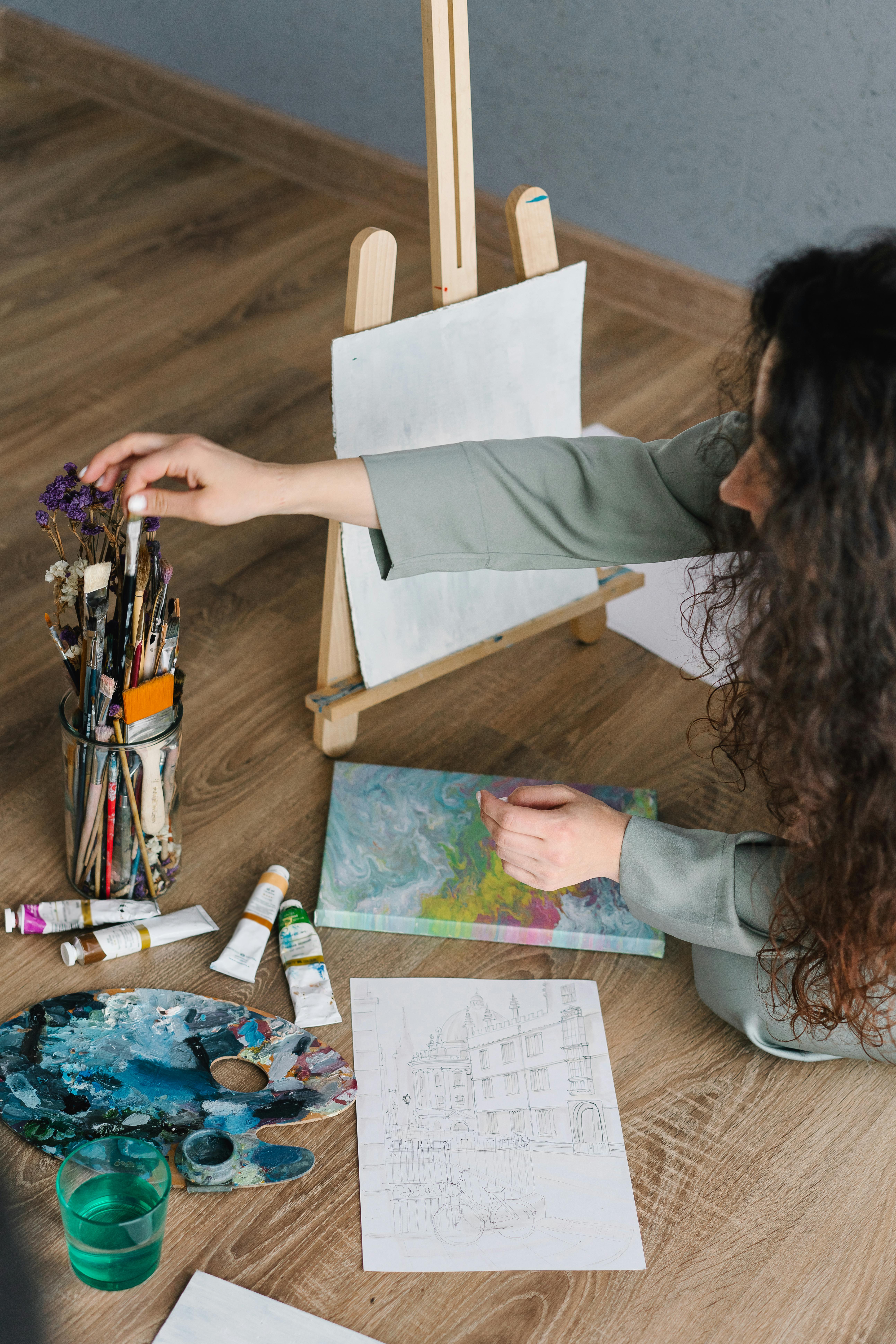
Beyond the dragon red: The elemental soul of asian color
The first step to mastering Zen hues is to release the notion that a specific color is inherently “Asian.” While colors like imperial yellow and cinnabar red have deep cultural significance, they are not the foundation of a tranquil home. The true essence lies in balance, nature, and the flow of energy, or Qi. This is beautifully captured in the ancient Chinese philosophy of Wu Xing, or the Five Elements.
This system provides a powerful lens through which to view your home. Instead of just picking paint chips, you are orchestrating a balance of five fundamental energies: Wood, Fire, Earth, Metal, and Water. Each element is associated with specific colors, materials, and emotions. By understanding this framework, you can create a space that feels coherent, intentional, and deeply calming.
This Photo was taken by cottonbro studio.
The five-element palette: Your blueprint for balance
Think of the five elements as your personal design compass. Rather than being restrictive, this system gives you a meaningful way to build a palette that resonates with the feeling you want to create. Let’s break down each element and its corresponding colors.
Wood: The energy of growth and vitality
Wood represents new beginnings, health, and expansion. It is the life force of nature. Bringing Wood into your home through color fosters a sense of vitality and creativity.
- Colors: All shades of green and brown. Think moss, sage, olive, deep forest green, and the warm tones of natural timber.
- How to use it: This is your easiest element to incorporate. Use it through living plants, a soft green accent wall, or wooden furniture. The use of natural materials like bamboo and rattan also channels this energy. This connects directly to the principles of mastering biophilic design by connecting your space with nature.
Fire: The energy of passion and transformation
Fire is the most powerful element, representing passion, inspiration, and social connection. It brings warmth and high energy to a space. However, a little goes a long way in a tranquil interior.
- Colors: Reds, vibrant oranges, deep purples, and strong yellows.
- How to use it: Use Fire colors as intentional accents. Think a single piece of art, a collection of cushions, or a lacquered tray. In a balanced space, these accents prevent serenity from becoming stagnation. The strategic placement of these powerful colors is a core concept when you learn to master Feng Shui for modern homes.

This Photo was taken by Photo By: Kaboompics.com.
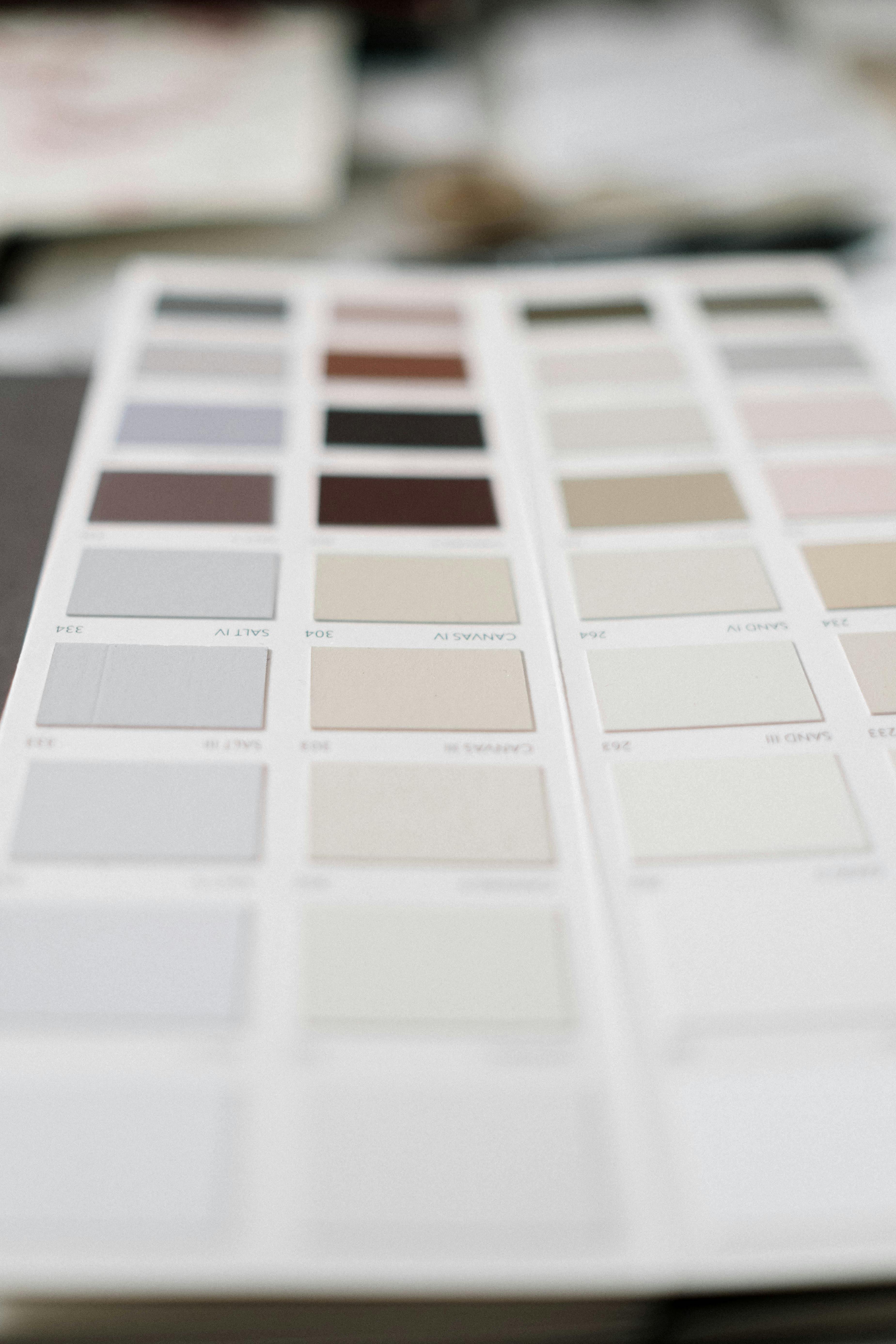
Earth: The energy of stability and nourishment
Earth is the grounding element. It promotes stability, protection, and a sense of being nurtured. This is the foundation of your tranquil palette.
- Colors: Sandy beiges, soft yellows, terracotta, and earthy ochres.
- How to use it: Earth tones are perfect for your primary wall colors, large rugs, and ceramic decor. They create a calming, neutral backdrop that allows other elements to shine without overwhelming the senses.
This Photo was taken by cottonbro studio.
Metal: The energy of clarity and precision
Metal brings logic, order, and focus. It encourages efficiency and mental clarity. Its colors add crispness and light to a space, preventing it from feeling dull.
- Colors: Whites, grays, and all metallic tones (gold, silver, bronze, copper).
- How to use it: Use shades of white and light gray for walls and ceilings to maximize light and create a sense of spaciousness. Metallic finishes on lighting fixtures, frames, or legs of furniture add a touch of sophisticated sharpness. The philosophy of finding beauty in simplicity and imperfection is a key part of embracing Wabi-Sabi principles in your home.
This Photo was taken by cottonbro studio.
Water: The energy of stillness and flow
Water represents wisdom, introspection, and the smooth flow of life. It brings a deep sense of calm and serenity, encouraging quiet contemplation.
- Colors: Deep blues, inky charcoals, and black.
- How to use it: Use Water colors to create depth and mystery. A charcoal accent wall behind a bed, a deep blue velvet sofa, or black-framed art can serve as a powerful grounding point in a room. In smaller rooms, using these deep tones strategically can create an illusion of depth and a cozy, enveloping feel, which is one of the key Asian interior design secrets for small homes.
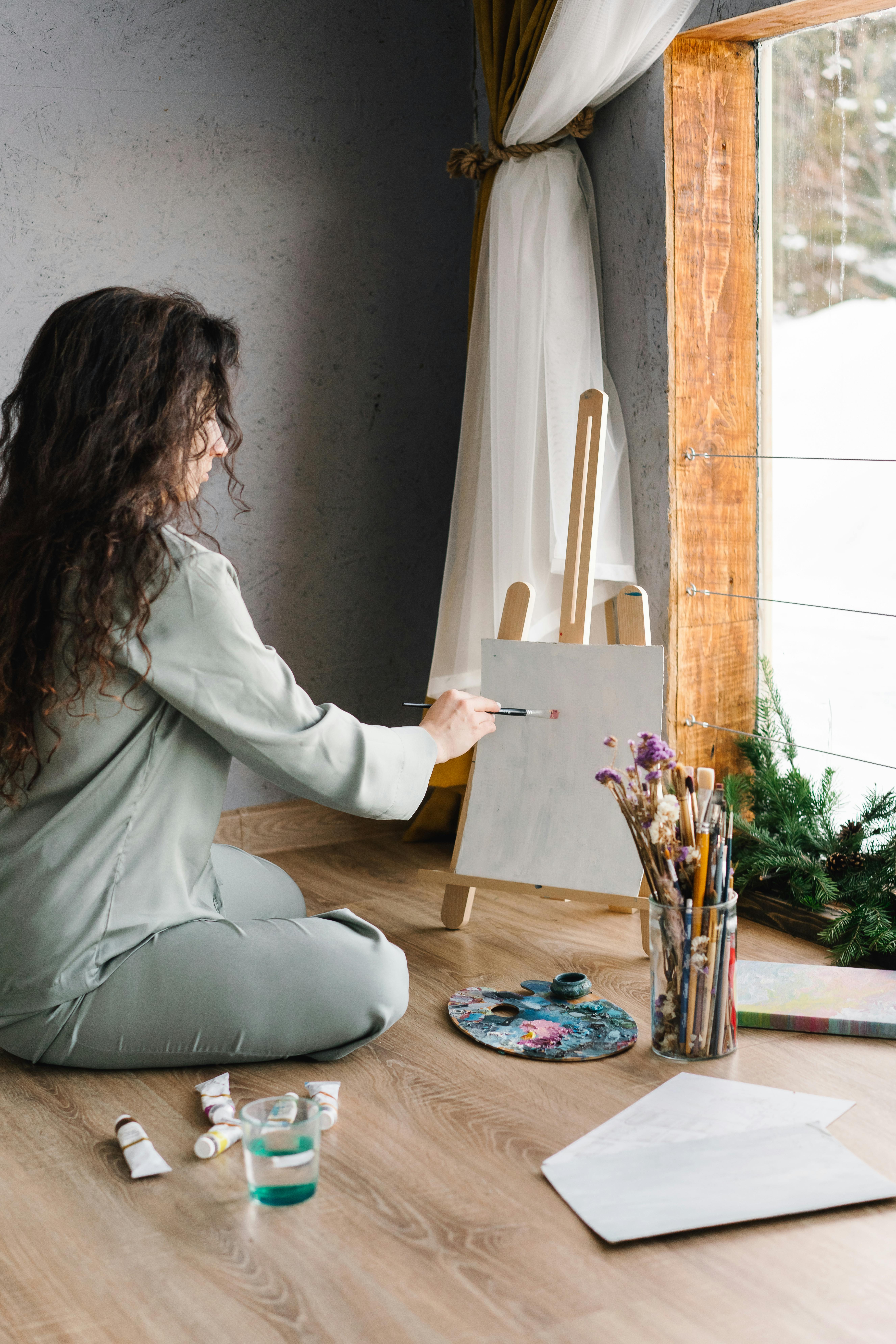
This Photo was taken by Mikhail Nilov.
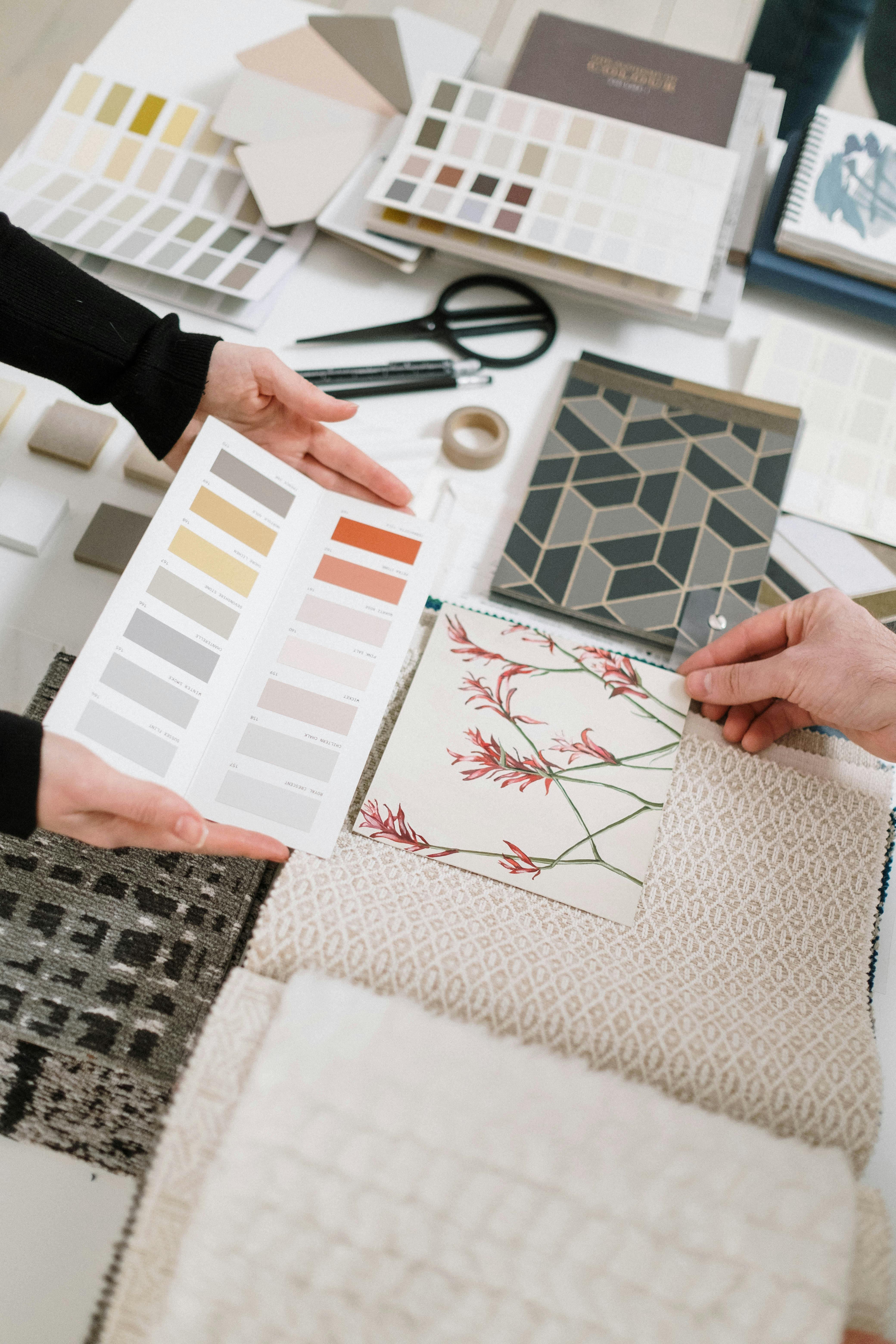
Weaving your elemental story
Now, how do you combine these elements without creating chaos? The key is hierarchy and layering. You don’t need all five elements in equal measure in every room. Aim for a dominant element supported by two or three others.
Start with a neutral foundation (Earth and Metal)
Begin your palette with a base of Earth and Metal tones. Think walls in a warm off-white, a soft greige, or a calming sandy beige. These colors are the canvas. They reflect light, create a sense of spaciousness, and provide the stable, grounding energy that is essential for a tranquil space.
Layer with nature’s touch (Wood and Water)
Next, introduce Wood and Water elements. Bring in lush green plants (Wood) to add life. Layer textiles in shades of green or deep blue (Wood/Water). Choose furniture in natural wood tones (Wood) or with black accents (Water). This layer connects your indoor space to the calming rhythms of the natural world.
Use accents with intention (Fire)
Finally, add your Fire element sparingly. This is the spark of life. A single cushion in a burnt orange, a vase in a deep magenta, or a piece of art with a splash of red. This intentional pop of energy brings the room to life and keeps it from feeling one-dimensional. It’s a statement of passion within a sea of tranquility.

This Photo was taken by Cup of Couple.
Data-driven tranquility: What the trends confirm
This ancient philosophy aligns perfectly with modern design trends. The search for tranquility is universal. According to a 2024 report by the International Interior Design Association (IIDA), there’s a significant consumer shift towards creating “wellness sanctuaries” at home. This is reflected in color trend forecasts for 2025, which show a continued dominance of nature-inspired and calming palettes.
| Color Trend (2025 Forecast) | Corresponding Five Element | Projected Growth in Use |
|---|---|---|
| Earthy Neutrals (Beige, Terracotta) | Earth | +22% |
| Biophilic Greens (Sage, Moss) | Wood | +18% |
| Restorative Blues (Deep Navy, Coastal Blue) | Water | +15% |
| Warm Minimalism (Off-Whites, Light Grays) | Metal | +25% |
Data sourced from WGSN Trend Forecasting and Pantone Color Institute analyses.
This data confirms that the elemental approach is not just philosophically sound; it’s precisely what modern homeowners are seeking. You are not just following a trend, but tapping into a timeless human need for balance and connection to the natural world.
This Photo was taken by cottonbro studio.
Frequently asked questions about zen hues
Can I still use black in an Asian-inspired interior?
Absolutely. Black corresponds to the Water element and is fantastic for creating depth, contrast, and a sense of sophisticated calm. Use it for picture frames, furniture legs, a single accent wall, or in patterns on textiles. The key is to balance it with lighter Earth and Metal tones to prevent the space from feeling heavy.
How many colors should I use in one room?
A good rule of thumb is the 60-30-10 rule, adapted for the elements. Choose a dominant element (Earth or Metal) for 60% of your space (walls, large furniture). Select a secondary element (Wood or Water) for 30% (textiles, accent furniture, plants). Finally, use a powerful accent element (Fire) for 10% (small decor, art).
Does this elemental color approach work for modern minimalist design?
Perfectly. In fact, it enhances it. Modern minimalism often relies on a Metal (whites, grays) and Earth (beiges) palette. Intentionally layering in Wood (a single large plant, a wooden stool) and Water (a dark-toned abstract painting) adds the depth and soul that can sometimes be missing from stark minimalism.
I live in a small apartment. Will dark colors make it feel smaller?
Not necessarily. Using a deep Water color like charcoal or navy on a single wall, especially the one furthest from the entrance, can actually create an illusion of depth, making the room feel larger. As noted by Architectural Digest experts, contrast is key. Pair a dark wall with light-colored furniture and sufficient lighting to maintain an open feel.
Is there a scientific basis for certain colors being calming?
Yes. Color psychology, a field studied extensively by institutions like The American Psychological Association, shows that colors like blue and green, which are prevalent in nature, can lower blood pressure and evoke feelings of calm. The Five Elements system intuitively organized these observations centuries ago.
This Photo was taken by cottonbro studio.
From palette to peace: Your home’s new harmony
So, what is the ultimate secret to mastering Zen hues? It is understanding that you are not merely decorating a room; you are composing a sensory experience. By moving beyond the clichés of red and gold, you have unlocked a far more powerful and authentic tool: the Five Elements. This framework frees you from the anxiety of getting it “right” and empowers you to make intentional choices based on the energy you want to cultivate. Your goal is no longer to replicate a style, but to orchestrate a personal sense of balance. Use Earth and Metal to build your foundation of stability. Layer in the life-giving energy of Wood and the serene flow of Water. Then, punctuate the calm with the deliberate passion of Fire. This is how you create a home that doesn’t just look tranquil, but actively nurtures your well-being. You now have the blueprint not just for a beautiful space, but for your own personal sanctuary.
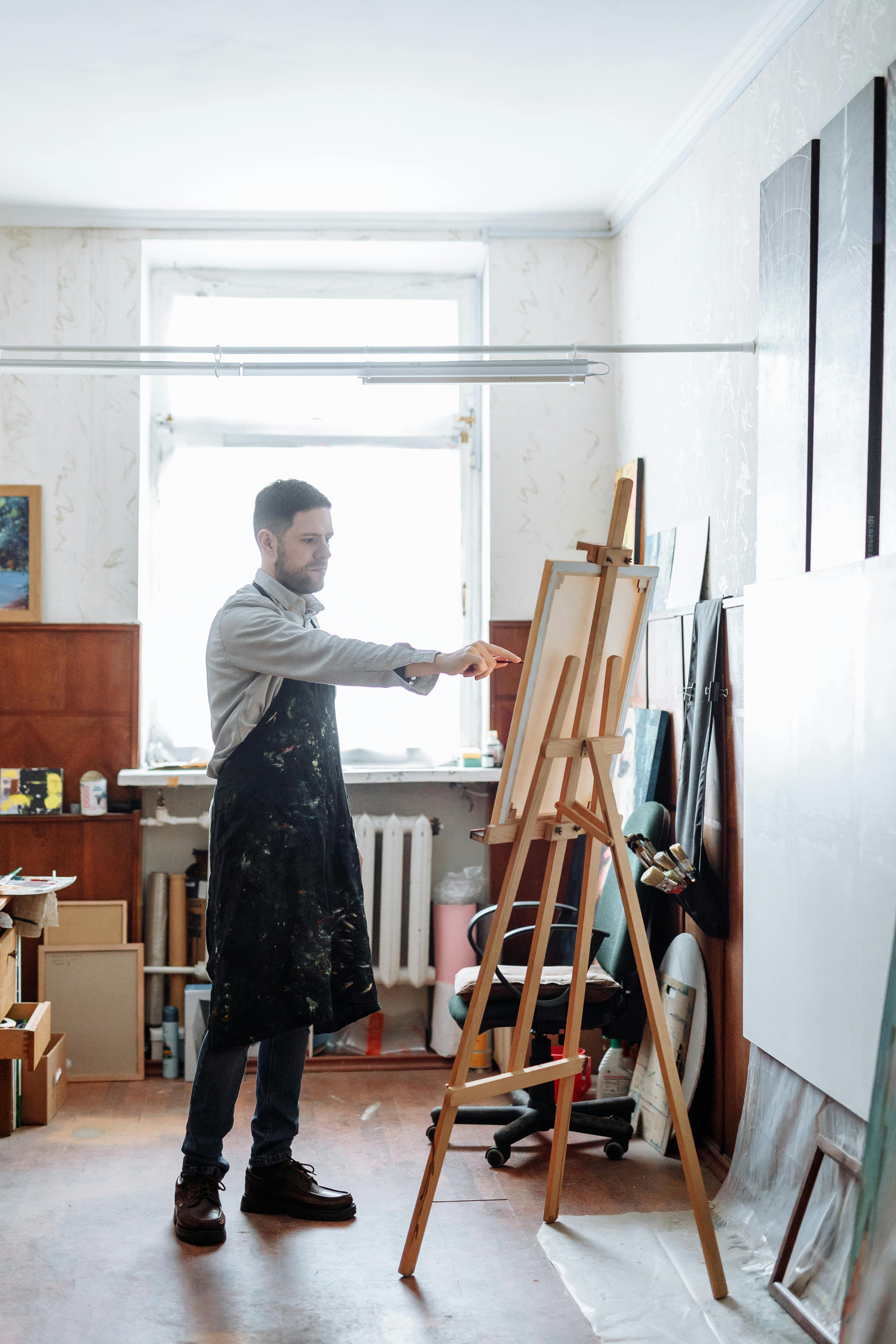
This Photo was taken by Thirdman.